

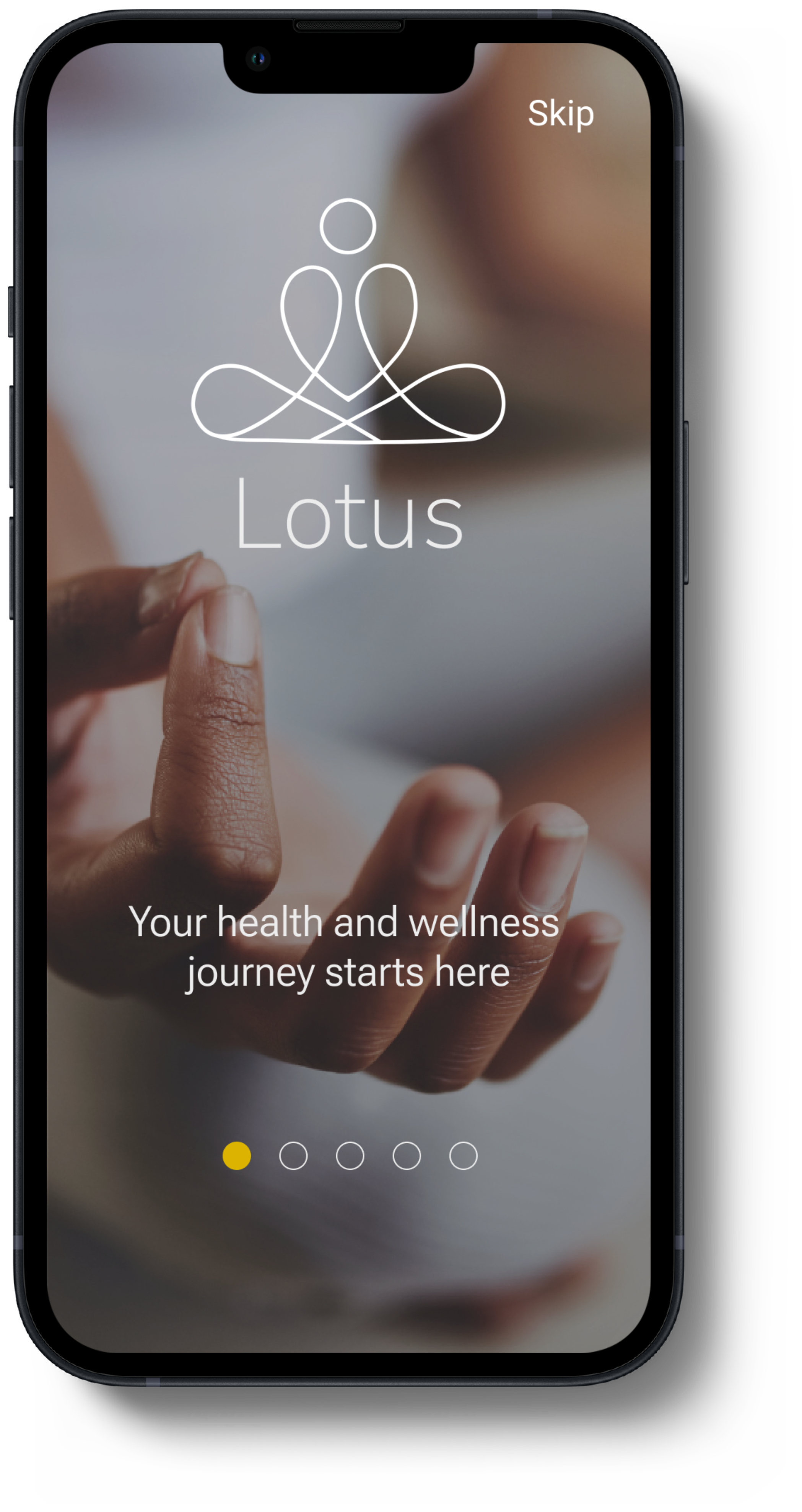
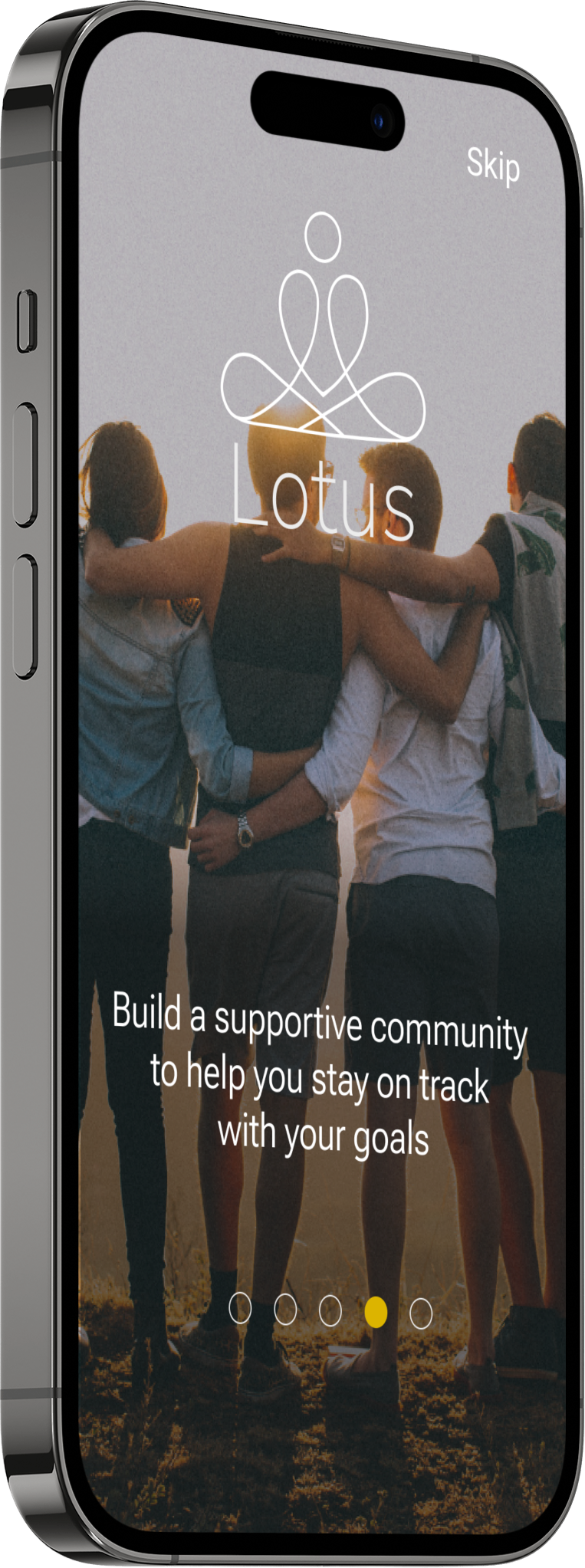
Lotus is a responsive health and wellness app that supports and inspires you towards an active and nutritious lifestyle.
-

My Role
Sole designer for the entire UX and UI process
-

Duration
6 month immersion with Careerfoundry
-

Tools Used
Figma, Canva, Procreate, Miro, Usability Hub
The Project

Allow health-conscious individuals to log in to a responsive health and wellbeing portal to record their health information, as well as access general physical and mental wellbeing features.
Objective:
As a yoga and meditation instructor, I wanted to create an app that takes a preventative approach to health by inspiring people to tune into their mind and bodies and develop healthy habits. This idea was further developed after following the UX design process of understanding, observing, ideating, prototyping and testing.
Overview:
Competitive Analysis
In order to determine the problem I conducted three competitor analyses. I observed responsive web apps that are managing health information and promoting health and wellbeing practices to see what they are doing well and where there are gaps. Once I had a better understanding of what is readily available and what some of the problems were, I could start to think about what features I would like to include in the Lotus app.
I researched their overall strategy and marketing profile, as well as conducted a SWOT Profile and UX Competitive Analysis.
Competitors:


-
Expensive monthly subscription
Most content is geared for beginners
Content is geared towards mental health
-
Requires the user to manually input data that is not related to steps, sleep or an external device
Primarily used for tracking health information
-
Comprehensive library of workouts that are easy to find and visually appealing
Could benefit from goal setting and progress indicators
Key Takeaways:
Most health and wellness apps are either movement or mindfulness focused.
Tracking and health storage features are limited and could be either automated and/or more thorough.
The opportunity lies in developing an app that contains an exciting library of movement and mindfulness classes with added progress and health tracking features.
User Research
The next step was to conduct user interviews to gain a better understanding of the target audience; their needs, goals and frustrations.
Based on these objectives I conducted 5 user interviews. The interview results were assorted using affinity mapping.

*Click on image to enlarge
User Personas & Journey Mapping
Using my research I created 2 user personas. My personas were useful tools in helping me view the perspective my users because they focus on their behaviours, motivations, and challenges. I also created journey maps for my personas to further understand the thought process and emotions of my users. Paired with my personas, my journey maps allowed me to find key opportunities for my app’s features and layout.
Persona #1:


Persona #2:


User Flows
The user flows helped me determine how I wanted to design the app’s architecture.


Card Sort & Site Map

Site Map
I developed a Site Map based off of the user flows that I had previously created and then refined the map once I had conducted card sorting with 7 participants.
I decided to create an open card sorting study because I wanted to see what categories participants came up with and whether or not they decided to group together the categories that I had anticipated in my previous sitemap with the cards available to them.
Some of the most common categories created were the following:
Food
Settings
Outside/outdoor activities
Nutrition
Some other observations:
"Profile" was added to the category "Settings" by three people.
3 People categorized "Trails, Hike, Bike, and Run" under "Outdoors".
4 different people created a category labelled "food" for Nutrition, and Recipes.
After revising the results of the card sorting study, I decided to keep most of my categories the same as in my previous sitemap. The reason behind this was that I found that most participants grouped together the cards that I used as categories in my previous sitemap with the same sub categories. For example, all users grouped together "Mindfulness" with "Meditation" and "Breathing".


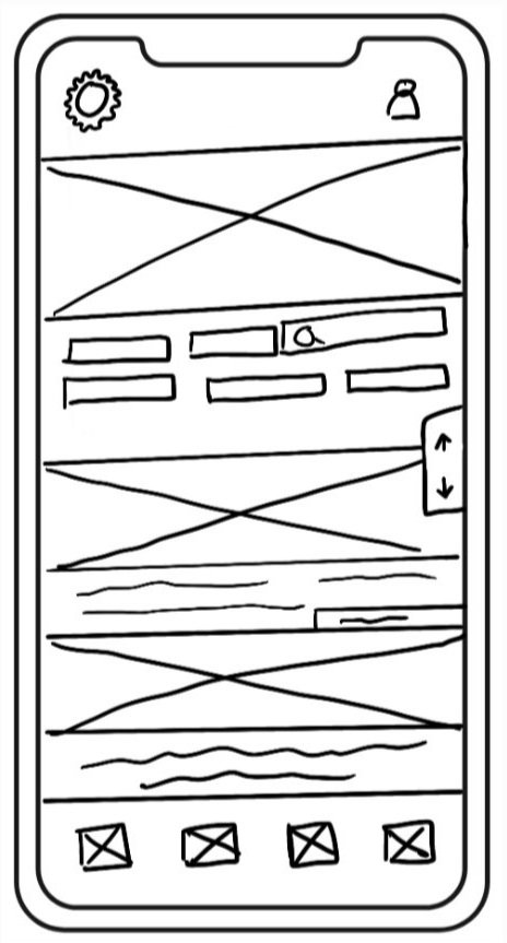
Wireframes & Prototypes
In order to determine how each screen would work, I sketched out low fidelity wireframes that eventually became mid fidelity clickable prototypes that could be tested.


Usability Testing
Goals
The goal of this study was to assess the learnability for new users interacting with the mobile app for the first time. I wanted to observe and measure if users understood the app, its value, and how to complete basic initial functions such as logging in, onboarding, learning more about a subject, and logging new health data.
Test Objectives
Determine if participants understand what the app is about quickly and easily and the value it provides.
Observe how users signup and login and go through the initial onboarding.
Observe how users log new health data.
Observe how users navigate the app to access blog articles to learn more about a specific health and wellness practice.
Participants & Schedule
6 participants were recruited from my network of family and friends.
The participants were asked to do 3 scenario-based tasks, answer corresponding questions and talk about their observations. The 3 tasks that participants were asked to perform were the following:
Create an account and answer the survey questions so that the app can cater content to your goals and interests.
Find an article about the “philosophy of yoga.”
Log a run that you forgot to track through your app manually as a new activity.
Key Findings
After conducting the usability tests, the data was analyzed and categorized through affinity mapping and the rainbow spreadsheet. 5 major issues were highlighted through this process.
1
Participants could not go back to the signup screen from buddies.
Severity: high
2
Most participants were confused about the "connect with buddies" page since it had no further explanation.
Severity: high
3
Participants wanted to select “movement” when asked to track their workout
Severity: high
Refining The Design
Below you will see examples of changes made based on user findings, preference tests and accessibility requirements. The final layout and aesthetic of my app involves aspects of Material Design and Gestalt principles.
Intro:


The original idea of the into screens was to have a rotating image that appears behind the sign up and login buttons. These images would give the user an idea about what the app is about. However, after receiving feedback from users, I decided it made more sense to separate the intro screen from the login and sign up screen. That way users have the option to either view the intro or skip it altogether.
Home:


The homepage started off with a very generic design. After conducting tests and receiving feedback, it was brought to my attention that users did not understand the difference between the menu and profile icons. I decided to combine them into one icon and further simplify the design by removing descriptive text, creating more white space with action buttons that pop more, and removing some of the text and image overlays to increase visibility of text and make it more accessible.
Learn:


The original idea for this screen was to have it similar to the homepage and mindfulness page by separating content with headers. I decided to change this to a mosaic style page with articles that appear based off the user's chip and relevance selections to create more visual interest. I also changed the chips from two rows to one to remove clutter and added the relevance option for further filtering.
Visual Design


Color Palette
Primary


The primary colors are neutral tones of whites, greys, and greens that encourage calmness, simplicity and cleanliness.
Secondary


The secondary colors include pops of yellow that adds energy, joy and optimism and other calming earthy tones to give a sense of peace found in nature, and inspired by the different lotus flower colors.
Grids & Spacing
Grids should be used to provide consistency in a responsive design. All elements should start and end within the columns, not the gutters.

Desktop
12 columns 70px margins 24px gutters


Iphone 13 Pro Max
4 columns 16px margins 20px gutters
Icons & Other UI Elements
Sliders should be used for making selections from a range of values
When interacting with a slider, changes should be reflected back to a user immediately
Sliders should present the full range of choices that are available to a user
Sliders can have two selection handles (thumbs) for when a user needs to select a range.

Sliders
Chips
Chips can be used as filters, inputs and suggestions.

Rounded corner radius: 14
Color: HEX #000000
Stroke: 1
Stroke color: #ECCD42

Fill color: HEX #585857

Rounded corner radius: 14
Fill color: HEX #ECCD42
Drop shadow: x=0, y=4, blur=4
General Icons

Menu Icons


Selected Menu Icons
Lessons Learned
I learned a lot throughout the process of developing this app, especially since it was my first time using design programs such as Figma and employing visual design methods. Some of my main takeaways are the following:
User interviews help me gain a lot of insight into the direction I should head with some of my main features, but instead of asking more generalized questions to see where the user goes with their answers, sometimes asking more specific questions can help yield better data. It is extremely important to think deeply about what kind of data am I seeking and what questions will help me gain that clarity.
Don’t get to hung up on the details! I could spend way too much time tweaking small aspects of the visual design, but ultimately this is not necessary when it comes to the functionality of the app.
Organize and label as you go so that you can easily find components you want to either use or edit.
Know your limitations as a designer and don’t spend too much time trying to solve complex psychological user problems.


Next Steps
In order to further refine the design, I would conduct more usability and preference tests and build out the rest of the app instead of focusing on some of the core features. I would also like to conduct more user interviews and do more research about how to make the app more community driven in order to increase engagement.